
Our brand world / Brandbook
Salesforce
delivered.
With proof.
How we show up.
How we speak. How we make things happen.
WeeNow · Identity in motionBrand assets ↗
The future starts
with us.
And it starts now.
WeeNow brings together two forces that set innovation in motion: we and now.
Connected people, ready to turn possibilities into action. Our identity brings that attitude to life: human in its presence, direct in its message and electric in its color.
Clarity to communicate.Warmth to connect.Energy to move forward.
One signature.
One presence.
Our logo and W/ symbol make us recognizable. Preserve the original files, their proportions and the relationship between their elements.

Keep its shape.Use the original artwork. Do not retype, stretch or recreate the brand.
Give it space.Keep the logo clear of text, borders and other elements.
Keep it legible.Choose backgrounds that keep every detail visible.

The W/ opens
possibilities.
The shape connects people, imagery and movement. In signature compositions, keep the layers aligned within the same frame.
Full photographs fill rounded panels. Cutout artwork belongs within the symbol compositions.
Purple is
movement.
Color with purpose: purple for energy, light tones for breathing room and depth for contrast. Hover and click to copy the HEX code.
Purple leads. Lilac illuminates.
Contrast makes everything legible.
Violet fields, dotted textures and shifting light define the brand's most vibrant surfaces.
Clear in words.
Bold in decisions.
Google Sans is WeeNow's typographic voice. One family, different weights and an instantly recognizable hierarchy.
Google Sans
abcdefghijklmnopqrstuvwxyz · 0123456789
Aa↗
ABCDEFGHIJKLMNOPQRSTUVWXYZabcdefghijklmnopqrstuvwxyz · 0123456789
Main message / 500
Built.
Working.
Supporting text / 400
Straight talk. Clear sentences.
Room for the message to breathe.
Action / 500–700Take the brand with you
People first.
Energy all around.
Purple jackets, magenta light and a confident presence. People take center stage; the graphic world amplifies their energy.

A world
that connects.
Our mascot brings warmth. Pearlescent elements express connection and energy. Give each composition a single focal point and preserve the integrity of every asset.
Download the brand essentials ↓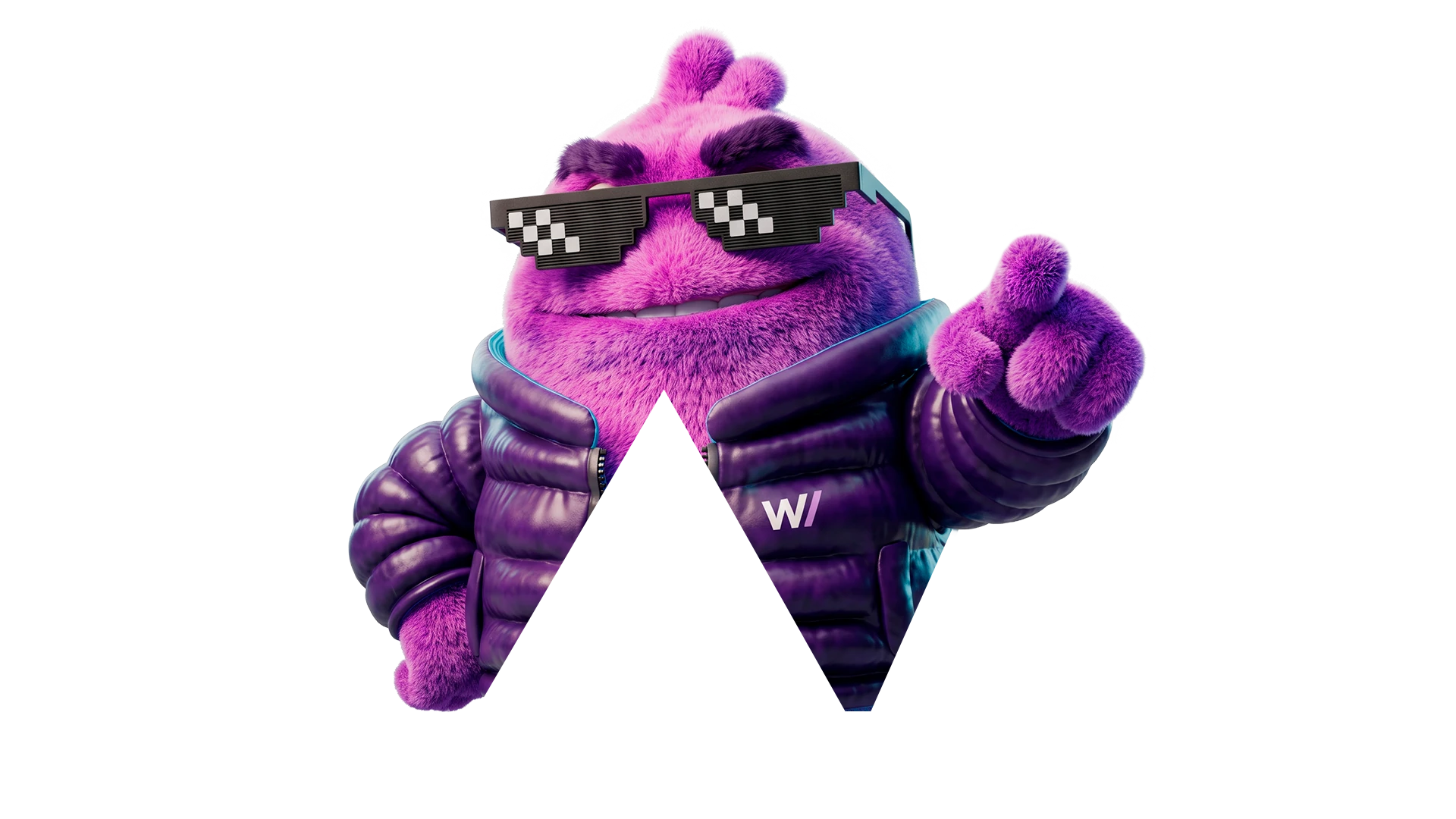


The whole picture.Match the panel's proportions to the photograph. Preserve faces, hands and the scene's focal point.
Soft corners.Use the brand's rounded surfaces with edge-to-edge imagery.
Purposeful movement.Light and gentle reveals guide the eye. Respect reduced-motion preferences.
The brand.
In your hands.
Logos, symbols and the color palette. The essential files for applying the identity consistently.
Download the full kit

Preserve the proportions and colors of the original files. The kit includes vector logos, W/ symbols and the palette in CSS and JSON.